
I'll admit it. I'm a bit of a sucker for a portrait composition.
Those beautifully layered vignettes, considered details and intimate moments within a space? Right up my alley.
There's something about working within a vertical frame that feels instinctive to me. Perhaps it's the way it allows me to isolate a moment, draw attention to a particular material or capture the relationship between a few carefully considered elements. Or perhaps I’m a slave to the Meta machine where Instagram favours portrait, especially for Reels.
But sometimes I have to remind myself to turn the camera sideways.. And not just because my clients need a few horizontal images for their websites.

This image enabled me to show the inside/outside. flow of the architecture, but still give context to the home in a bushland setting by playing on the balcony reflections.
The art of going wide
In architecture and interiors photography, a landscape composition can be surprisingly tricky to get right. It's tempting to think that shooting horizontally simply means fitting more of a space into the frame. But more isn't always better.
A wider composition introduces more elements to consider. Furniture, architectural lines, light, negative space, the relationship between objects. Suddenly, there's a whole lot more happening within those four edges.
And while a wider lens might solve the problem of fitting everything in, it doesn't necessarily make for a stronger photograph.
For me, the challenge is finding a composition that feels intentional. One where the elements work together, the eye moves naturally through the space, and nothing feels like it's there simply because it happened to fit.
Sometimes that means moving furniture a few centimetres. Sometimes it's shifting my camera position ever so slightly. Sometimes it's recognising that the strongest horizontal composition isn't the widest one at all.
The trick isn't fitting more into the frame. It's knowing what deserves to be there.
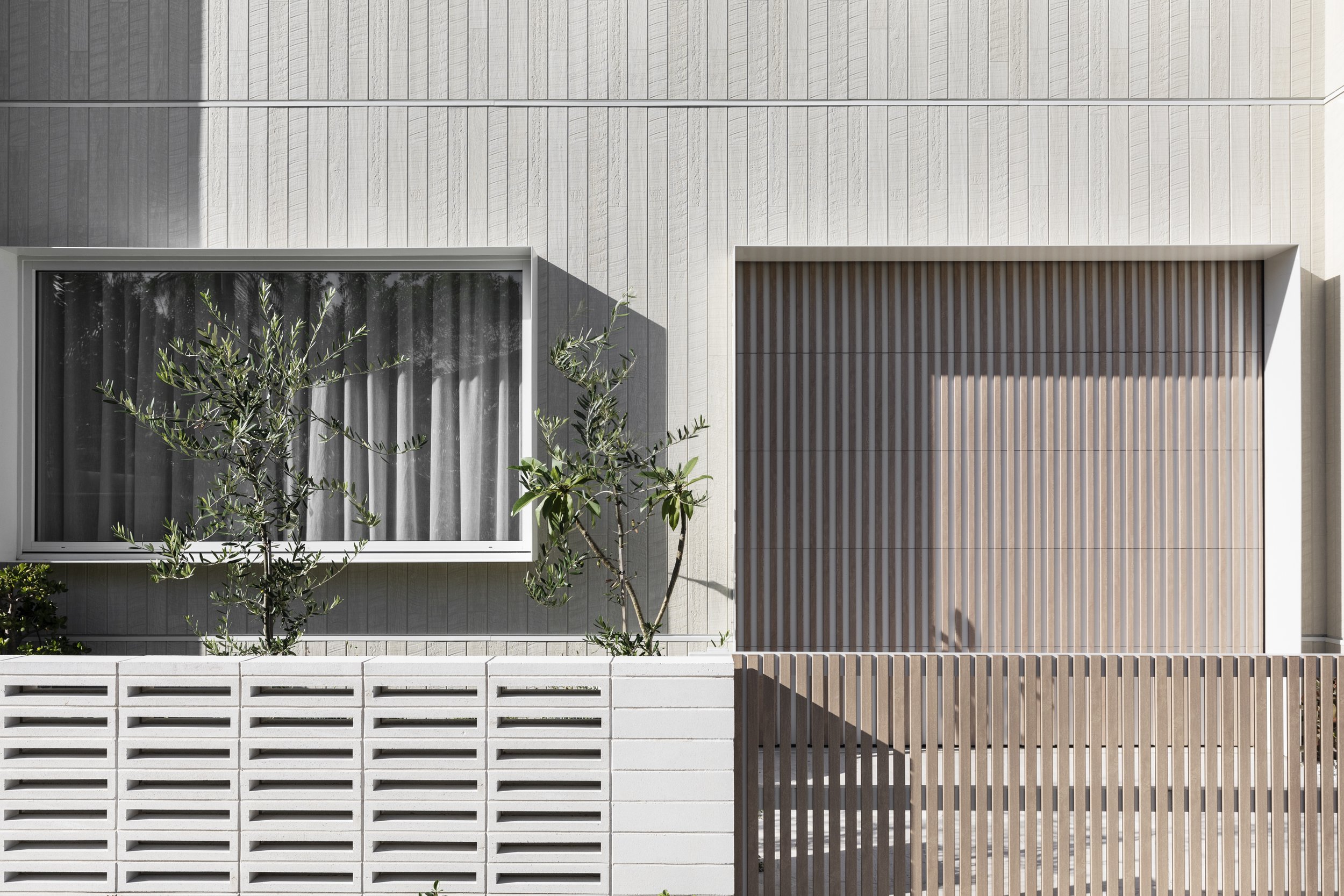
A graphic, restrained composition, hero-ing the geometry and shadows to create interest and focus on the finishes.
My creative brain versus my commercial brain
While my creative brain might naturally gravitate towards portrait compositions, my commercial brain knows just how valuable a beautiful horizontal image can be.. The photographs I create aren't just destined for Instagram.. They're part of a much bigger picture.
For architects, interior designers and builders, a thoughtfully photographed project becomes a library of imagery that can be used across multiple platforms, often for years to come.. Think website banners, project portfolios, editorial submissions, awards entries, digital campaigns and print publications.. And each of those applications has different requirements.
A beautiful portrait image might be perfect for an Instagram carousel or an editorial feature, but it isn't necessarily going to work across a full-width website banner.
Likewise, a carefully composed landscape image can offer breathing room for text, accommodate different crops and give designers greater flexibility when creating marketing material.
That's why I consciously work towards delivering a considered mix of orientations when photographing a project. Not simply to tick a box, but to create a collection of images that's both visually compelling and genuinely useful.

This image could work perfectly as a web banner.
Finding beauty in the horizontal
Of course, not every horizontal photograph needs to be a sweeping architectural view. Some of my favourite landscape compositions are actually quite intimate: a beautifully detailed bathroom; quiet corner of a living room; the relationship between a window, a piece of furniture and the landscape beyond.
There's an art to finding those smaller moments within a wider frame, and I think that's where horizontal photography can become particularly interesting. It's about maintaining that sense of intimacy and intention, even when the composition gives you more room to play.
And when it works? So good.
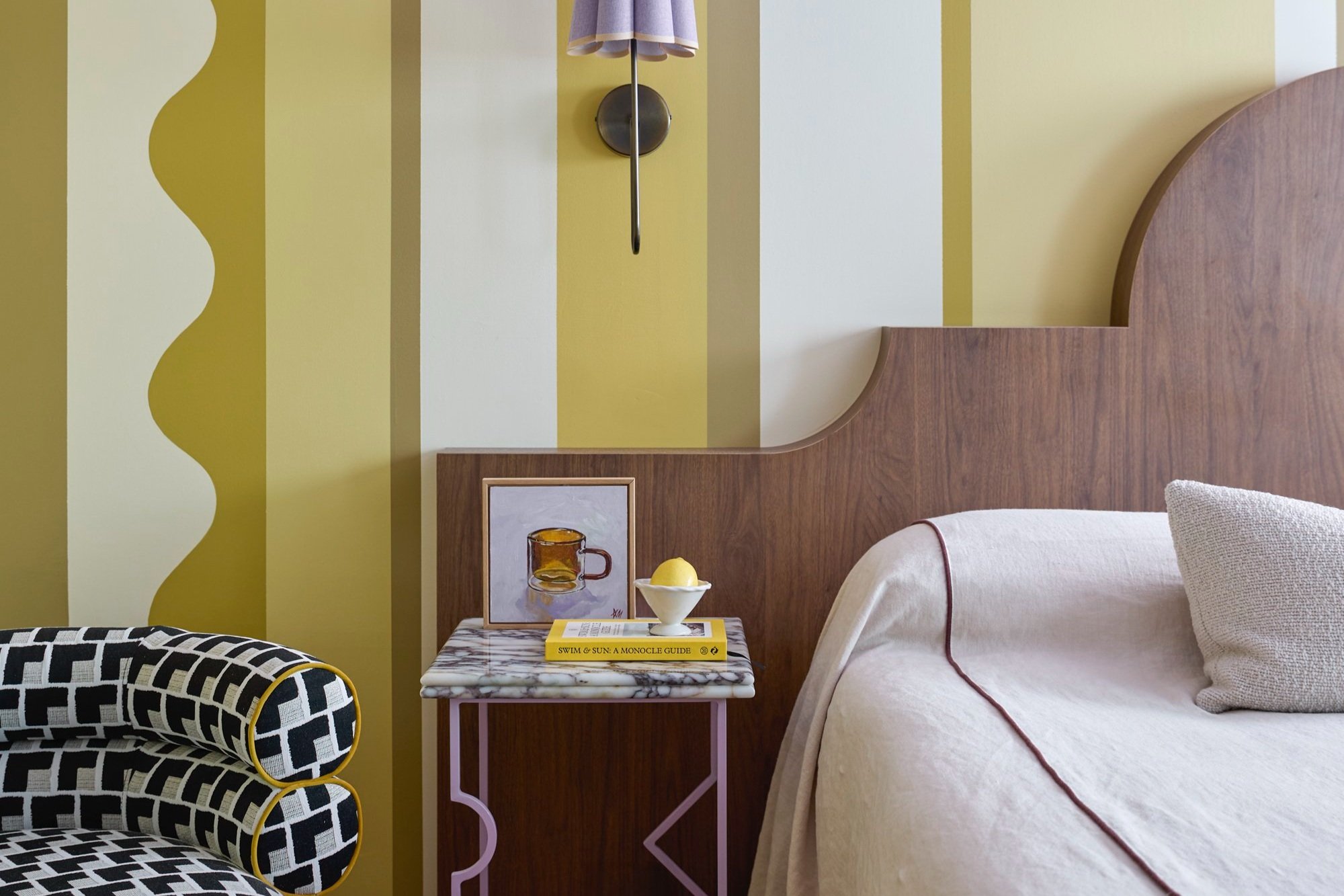
This landscape moment focuses on the array of colour, materials and patterns used in a tiny bedside moment/
A little reminder to myself
After 10 years photographing architecture and interiors, I still find myself consciously challenging the way I see and compose spaces. I think that's a good thing.. It's easy to fall into familiar ways of working, particularly when you know what you like and what works.
But some of the most rewarding images come from pushing beyond those instincts, trying something different and giving a composition a little more time.
So here's a little appreciation for the horizontal frame.
Sometimes I need the reminder too.